Lately, I've been coveting wallpaper. As much as I have hated removing (and on occasion, I confess *gasp*, painting over) it, there is something about muted wallpaper colors, with their barely-there designs, that speak to me. I confess there is a part of me that thinks I could just try to re-create the feeling with paint (and not have to worry about the headache when the need for change came - which always does) ... but somehow I imagine that "painting wallpaper" might be too difficult a task for me. Or simply too much work.

I love the wallpaper in this photograph. Atlanta Bartlett's interiors are pure loveliness, and this one is no exception. The wallpaper brings just the right amount of subtle pattern to this room. For more of Bartlett's soothing designs, click here.
Trove has some beautiful designs. I have to say, though, that I really like the composition of their photographs, and it makes me wonder if that is part of the reason that I am so attracted to their lines. Unfortunately, I could not get to download any full pictures except for the one on the left. I do love their ankaa pattern - probably my favorite. I only managed to get a photo of their swatch. *sigh..!* I guess this will have to do for now:


Stop by their website for the full collection. It's a treat.
Marimekko has some beautiful patterns too; they are a lot punchier and more graphic than Trove's, but I could still see myself using them at home. (Notice how I'm sticking with grays and neutrals. For those of you with wilder color fantasies, maybe I will get there some day. For now though, I am looking to create serene, peaceful spaces at home.)

(Then again, it may be the rustic table top and that chair peeking from behind that attract me the most to this photograph.)

My idea of wild and crazy. Ha! I could see using either of these in pretty small doses - like, on the inside of a closet-turned- office, or to cover the back of open shelving.
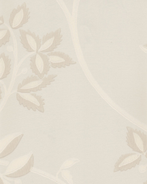
Farrow and Ball is always classic, and I guess I tend to gravitate toward the safety of not just muted colors, but also, classic lines. And for those reasons, I love this pattern - and I'd probably do the color combination on the swatch (Ringwold Papers BP 1613). Delicate, simple, and vintage-inspired. What else could I need?

Visit their site here for more ideas.
I am not sure where (or if, for that matter) I will put up wallpaper at home. I worry that it will be just a phase. We'll see. For now, I like the eye-candy that all of this provides. Like butterflies in the pit of my stomach. A Spring fling?
(images: atlanta bartlett, trove, marimekko, farrow & ball)

I love the wallpaper in this photograph. Atlanta Bartlett's interiors are pure loveliness, and this one is no exception. The wallpaper brings just the right amount of subtle pattern to this room. For more of Bartlett's soothing designs, click here.
Trove has some beautiful designs. I have to say, though, that I really like the composition of their photographs, and it makes me wonder if that is part of the reason that I am so attracted to their lines. Unfortunately, I could not get to download any full pictures except for the one on the left. I do love their ankaa pattern - probably my favorite. I only managed to get a photo of their swatch. *sigh..!* I guess this will have to do for now:


Stop by their website for the full collection. It's a treat.
Marimekko has some beautiful patterns too; they are a lot punchier and more graphic than Trove's, but I could still see myself using them at home. (Notice how I'm sticking with grays and neutrals. For those of you with wilder color fantasies, maybe I will get there some day. For now though, I am looking to create serene, peaceful spaces at home.)

(Then again, it may be the rustic table top and that chair peeking from behind that attract me the most to this photograph.)

My idea of wild and crazy. Ha! I could see using either of these in pretty small doses - like, on the inside of a closet-turned- office, or to cover the back of open shelving.
Farrow and Ball is always classic, and I guess I tend to gravitate toward the safety of not just muted colors, but also, classic lines. And for those reasons, I love this pattern - and I'd probably do the color combination on the swatch (Ringwold Papers BP 1613). Delicate, simple, and vintage-inspired. What else could I need?


Visit their site here for more ideas.
I am not sure where (or if, for that matter) I will put up wallpaper at home. I worry that it will be just a phase. We'll see. For now, I like the eye-candy that all of this provides. Like butterflies in the pit of my stomach. A Spring fling?
(images: atlanta bartlett, trove, marimekko, farrow & ball)
loveliness. so peaceful.
ReplyDeleteI love the bed it's beautiful and all the linens ,love the white pillows too,simply stunning!
ReplyDelete